Apple Music Unveils New Visual Identity Inspired by Sound Waves
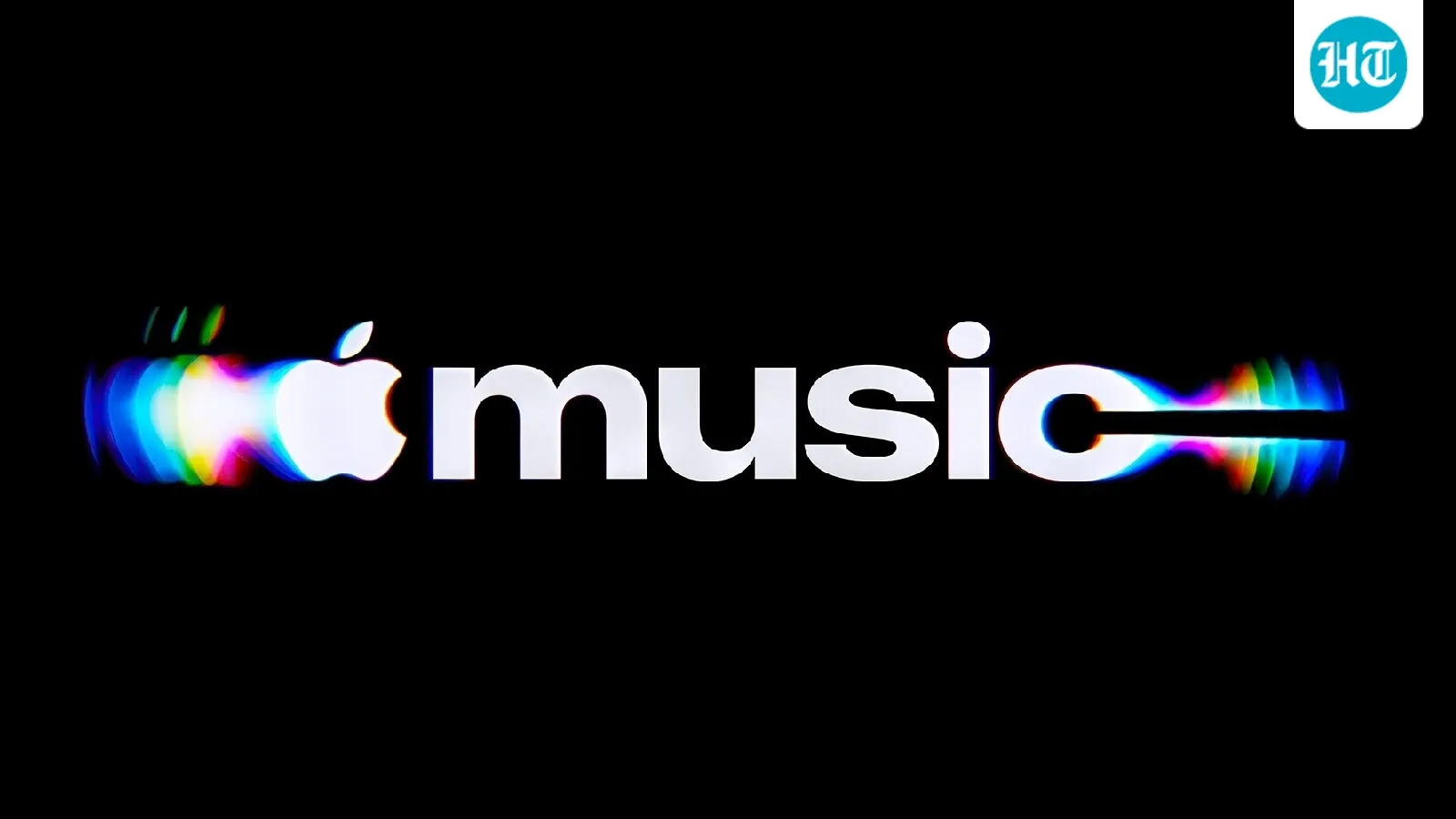
Apple Music has introduced a new visual identity centered on translating sound into physical visuals using liquid, light, and glass-inspired motion. The redesign features a new mnemonic logo created by filming liquid vibrations produced by audio frequencies, alongside a customized wordmark with bold, lowercase lettering. This approach aims to reflect the movement of sound waves visually, extending across Apple Music's branding and marketing materials to create a cohesive and dynamic representation of music.
First-hand measurement across 2 sources
We measured how 2 outlets covered this story. No outlet gave this story a measurable political slant — there is no left–right reading to report. Overall sentiment is positive (64/100). Lens Score 34/100.
Outlets measured: hindustantimes, thehindu. See how each one headlined and framed the same story in the source comparison below.
AI Analysis
Sentiment was consistent across outlets (52–75/100), indicating broadly factual reporting rather than editorialising.
Coverage timeline
thehindu broke this story on 22 Oct, 05:59 am. Other outlets followed.
- 1