Google Play Store Rolls Out Visual Redesign with Updated Navigation and Increased User Interest
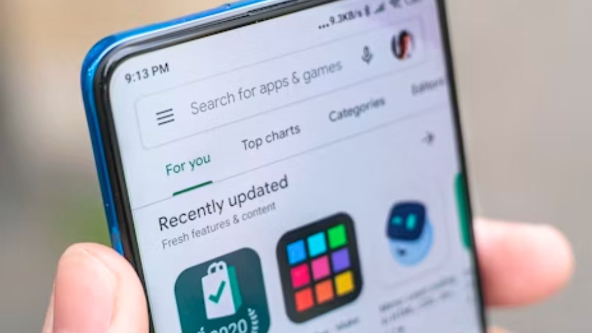
Google has introduced a visual redesign to the Play Store, notably updating the Apps and Games tabs with rounded navigation elements and promoting the personalized 'For You' feed as the default landing page. This update also includes refreshed Play Points displays and notification badges. User interest surged, with Google Trends showing increased searches for Play Store downloads, PC compatibility, and developer-related queries. The redesign is rolling out in stages, with some sections like the Books tab retaining the previous interface for now.
First-hand measurement across 2 sources
We measured how 2 outlets covered this story. Coverage leans balanced overall (Left 0%, Centre 100%, Right 0%). Overall sentiment is positive (70/100). Lens Score 30/100 — low public interest.
Outlets analysed (first-hand measurement by TBN's Bias Engine):
- thefinancialexpress— balanced framing, positive sentiment
- republicworld— balanced framing, positive sentiment
AI Analysis
The articles focus on a technology update without political framing, presenting factual information about Google's Play Store redesign and user reactions. Both sources emphasize user experience and search trends, avoiding political perspectives or ideological interpretations, thus maintaining a neutral stance centered on product changes and consumer interest.
The overall tone across the articles is neutral to mildly positive, highlighting user curiosity and the modernized design elements without expressing strong opinions. The coverage emphasizes functional updates and increased engagement, reflecting an informative and descriptive sentiment rather than critical or celebratory language.
How 2 sources covered this story
Each source's own headline, political lean, and sentiment — so you can see framing differences at a glance.