How to Use The Balanced News App to Escape News Bias
TL;DR: Most news apps show you what keeps you scrolling. The Balanced News shows you what's actually happening by comparing 50+ Indian sources, scoring political bias, and flagging loaded language. Here's a practical, feature-by-feature guide to using the app effectively.
You're Probably in a News Bubble. That's Not Your Fault.
If you primarily read news from one or two sources, your understanding of any major story is, at best, incomplete. At worst, it's been shaped by editorial choices you never agreed to.
This isn't a personal failing. It's how news works. Every outlet picks an angle. Every editor decides which facts lead and which get buried. When you read only one version, you mistake a perspective for the full picture.
A 2024 Reuters Institute study found that 55% of news consumers globally worry about distinguishing real news from false news. In India, where the media ecosystem is intensely fragmented along political lines, that number is likely higher.
The Balanced News was built to address this. Not by telling you which outlet to trust, but by showing you how the same story reads differently across the political spectrum. Let's walk through how to actually use it.
The Bias Spectrum: Your First Stop for Any Story
When you open any story on The Balanced News, the first thing you'll notice is the political spectrum breakdown. It's a simple visual: a bar split into Left, Center, and Right percentages.
This isn't some arbitrary label. The app's AI analyzes word choice, framing, entity coverage, and sentiment across every source covering that story. If 12 outlets reported on a policy announcement, and 8 used language aligned with government messaging while 4 questioned it, the spectrum reflects that split.
How to use it: Don't just glance at the percentages. Click through to the individual articles. A story showing 70% Right-leaning coverage doesn't mean the story itself is right-wing. It means the majority of coverage came from outlets with that editorial lean. The interesting question is always: what did the 30% say differently?
For deeper context on how this scoring works, The Balanced News has published a detailed breakdown of its bias calculation methodology.
Sentiment Score: The Emotional Temperature of a Story
Every story on the app gets a sentiment score from 0 to 100. Low scores (0-30) indicate negative or alarming coverage. Mid-range scores (30-60) suggest mixed or neutral treatment. High scores (60-100) mean the coverage is broadly positive or optimistic.
Why does this matter? Because the same event can feel like a crisis or a triumph depending on how it's framed. When markets dropped 2% after geopolitical tensions, some outlets ran "bloodbath" headlines while others reported it as a routine correction. The sentiment score helps you see past the emotional framing.
How to use it: If a sentiment score seems unusually low (or high) for what the story actually describes, that's a signal. It means the coverage itself is more emotionally charged than the facts warrant. That's worth noticing. For more on how emotional framing works in financial news specifically, see TBN's analysis of how "bloodbath" headlines turn market dips into panic.
Lens Score: Finding the Stories Nobody Wants You to See
This is arguably the most underrated feature. Lens Score measures the gap between a story's public importance and the media attention it actually received.
Think of it as a mismatch detector. A new government policy affecting millions of farmers might get a Lens Score of 85 (high importance, low coverage), while a celebrity controversy gets buried under a mountain of articles despite being, objectively, not that significant.
How to use it: Sort stories by Lens Score to find the ones that mainstream media is underplaying. These are often the stories that matter most to your daily life but don't generate clicks. Infrastructure policy changes, regulatory updates, local governance decisions. The stuff that's boring to write about but important to know. For an explanation of the methodology, read TBN's dedicated piece on what Lens Score is and how it works.
Adjective Analysis: Catching Loaded Language in Real Time
This feature is subtle but powerful. The app flags loaded adjectives and phrases that outlets use to frame stories.
Consider the difference between "the government announced a new policy" and "the government unveiled a bold new initiative." Both describe the same event. One is reporting. The other is editorializing. The adjective analysis tool highlights exactly these choices.
In Indian media, this matters enormously. Words like "surgical," "historic," "disastrous," or "unprecedented" are often deployed strategically. They tell you more about the outlet's position than about the event itself.
How to use it: Pay special attention to adjective flags on political stories. When you see highlighted words, ask yourself: would this sentence mean something different without that adjective? If yes, you've just identified editorial spin.
Framing Detection: Same Story, Different Worlds
Open any major story and you'll find articles from outlets across the spectrum. The app's framing detection doesn't just show you multiple sources. It highlights what facts each outlet emphasized and what they left out.
During the India-US trade deal coverage in early 2026, for example, right-leaning outlets focused on tariff reductions and diplomatic wins. Left-leaning outlets zeroed in on concessions made on Russian oil purchases and agricultural impacts. Both sets of facts were true. Neither told the complete story alone.
How to use it: When reading a story that matters to you, open at least three articles from different parts of the spectrum. Don't read them to decide who's "right." Read them to collect the full set of facts that no single outlet gave you.
Custom Feeds: Breaking Your Own Filter Bubble
The app lets you create personalized feeds based on topics, regions, and categories. You can follow Politics, Business, Sports, Technology, Entertainment, Health, Science, and more.
But here's the trick most people miss: the value isn't in following what you already care about. It's in adding one or two categories you'd normally skip.
How to use it: If you primarily follow political news, add a Science or Economy feed. If you're all business, add a Politics feed. You'll start noticing how stories connect across domains. A trade policy affects markets. A tech regulation affects media. The intersections are where the real understanding lives.
The app also supports seven Indian languages: English, Hindi, Marathi, Gujarati, Tamil, Telugu, and Bengali. If your preferred language isn't English, switch to it. You'll likely find the coverage more nuanced because regional-language outlets often cover local impacts that English media misses entirely. TBN has documented how regional media bias patterns vary significantly from national outlets.
The Multi-Source Comparison View
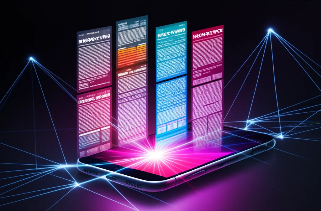
This is the core experience. For every story, the app aggregates coverage from 50+ Indian news sources and organizes them by political lean. You can see at a glance which outlets covered the story, how they covered it, and what their angle was.
How to use it: For any story you feel strongly about, force yourself to read the article you'd least want to read. If you lean left, read the right-leaning coverage. If you lean right, read the opposition perspective. Not to agree with it, but to understand what facts and arguments the other side is working with. It's uncomfortable. It's also the fastest way to develop a genuinely informed opinion.
Common Mistakes (and How to Avoid Them)
Mistake 1: Treating the bias score as a truth meter. A right-leaning score doesn't mean the coverage is wrong. It means the framing leans a particular way. Facts can be accurate and still be biased in their selection and presentation.
Mistake 2: Only reading center-rated coverage. Center doesn't mean best. It means different. Sometimes the most important reporting comes from outlets with clear editorial leans because they dig deeper into stories that align with their audience's concerns.
Mistake 3: Checking the app only during big stories. Bias is most powerful when it's invisible. The daily, routine coverage of policy, governance, and economics shapes your worldview more than the big breaking stories. Check regularly, not just during crises.
Mistake 4: Ignoring Lens Score. The stories the media doesn't want to cover are often the ones you need to know about. Make Lens Score sorting a weekly habit.
The Key Takeaway
No single news source, including The Balanced News, will give you the complete truth about anything. That's not how information works. What the app does is make the gaps, biases, and framing visible, so you can fill them in yourself.
The goal isn't to become cynical about media. It's to become a better reader of it. Use the bias spectrum to see the landscape. Use sentiment scores to check emotional manipulation. Use Lens Score to find buried stories. Use adjective analysis to catch spin. And above all, read widely, especially the perspectives you disagree with.
In a country with over 50 major news outlets competing for your attention, the reader who sees the full picture has the real advantage.